A bright new identity for a people-first brand
Rebranding Tap HR into Haylo HR with a bold new identity and unified presence.
The challenge
Tap HR had built a solid reputation but the brand no longer reflected the company's values, personality, or ambition. The existing identity felt outdated, and there was no consistent visual language across their website, social media, or event materials. They needed more than a refresh — they needed a complete repositioning.
What we did
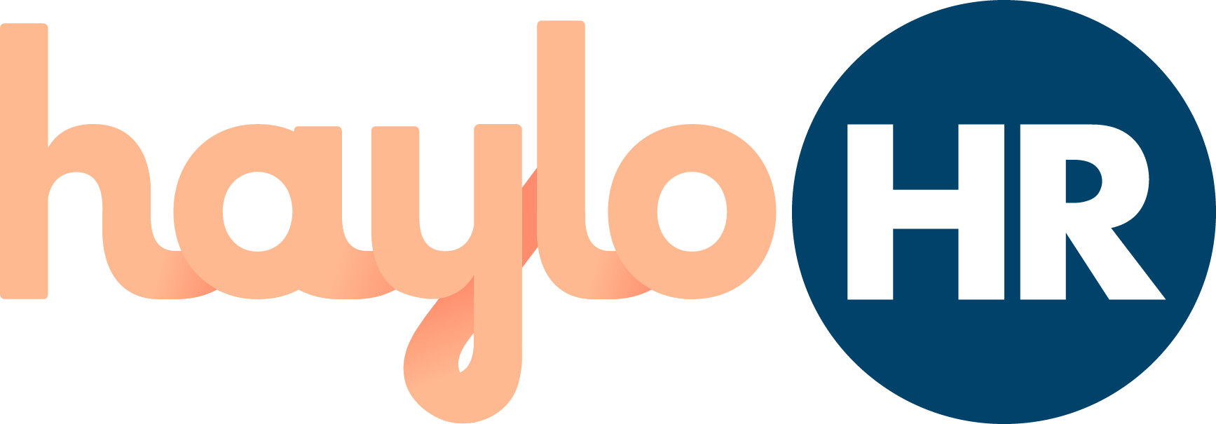
We partnered with Tap HR to reposition and rename the business, creating a new identity that became Haylo HR. The rebrand included a fresh logo, updated colour palette, and comprehensive brand guidelines that reflected the company's values and tone of voice. We reworked their website to align with the new brand and provided a suite of assets for social media to ensure consistency across all channels. We also refreshed their existing marketing collateral for events, helping them show up with confidence and clarity in every setting.
The numbers speak for themselves
- ✓ Full rebrand from Tap HR to Haylo HR, reflecting a clearer purpose and personality
- ✓ 20+ brand assets delivered across social, web, and events for consistent visual identity
- ✓ 100% brand transformation from logo and colour palette to messaging and marketing collateral
- ✓ 5 brand pillars defined with clear values and tone of voice anchoring the brand across all channels
- ✓ Fresh logo and updated colour palette designed to reflect company values
- ✓ Website reworked to align with the new brand identity
- ✓ Refreshed marketing collateral for events, ensuring confidence and clarity in every setting
Want results like these?
Every business is different, but the approach is the same - smart strategy, brilliant execution, measurable outcomes.
Let's talk →